


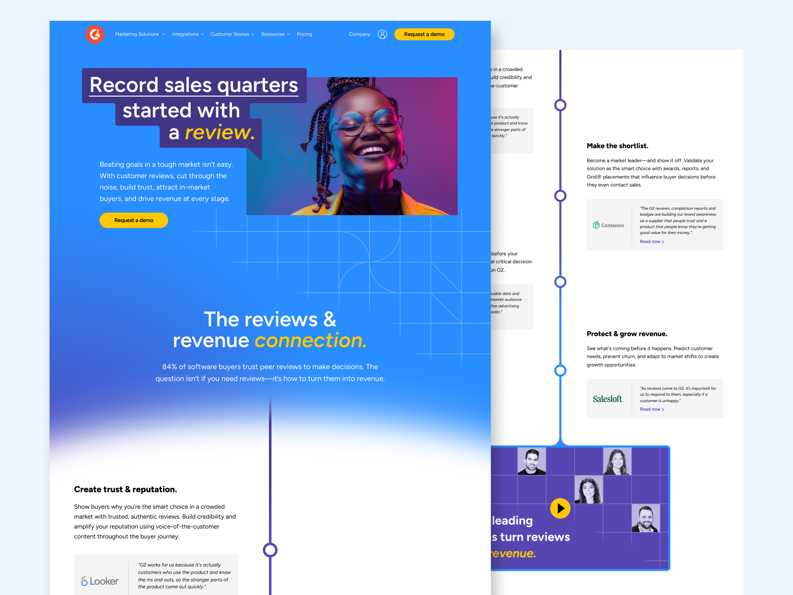
“It started with a review” Campaign
This campaign launched in Q4 ‘24 in response to sluggish sales & market headwinds —with current and prospective customers not fully seeing or appreciating the connection between reviews enabled by G2 and the impact on revenue. The objective was to create more human moments and vignettes drawn from our rich existing database of customer success stories & proof points. We explored three distinct looks during the concepting phase before landing on what’s seen here, extended across a variety of touchpoints.


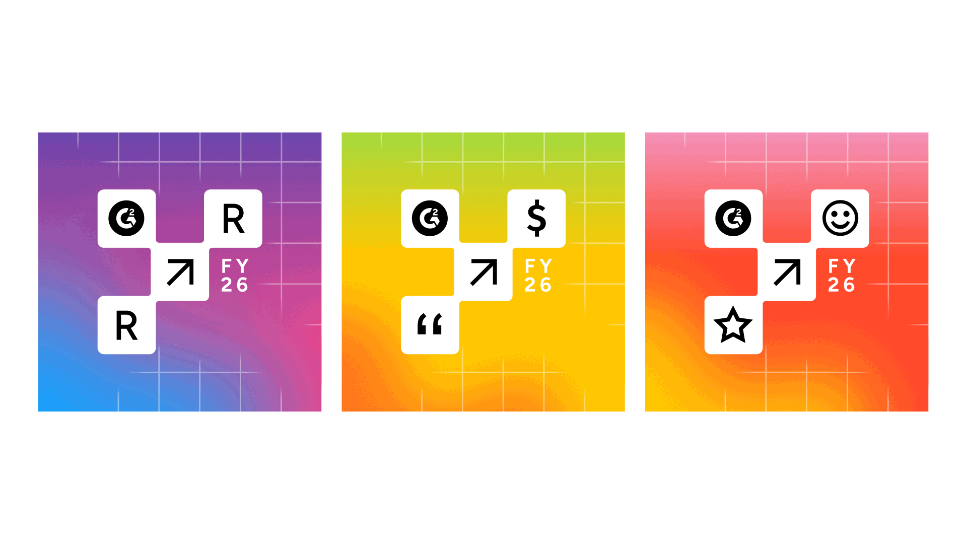
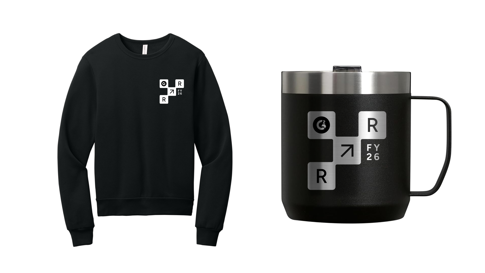
“Review to Revenue” internal kickoff event
Building off of the well-received visual language and messaging of our 2025 “It started with a review” campaign, we aimed to make the reviews to revenue connection applicable to every G2 employee via personalized storytelling and session topics. While not the most exciting theme/name (it was dictated by ELT based on ongoing leadership convos), the visual system developed allowed for a good amount of fun and richness across every event touchpoint. More to come here as additional pieces are finalized.


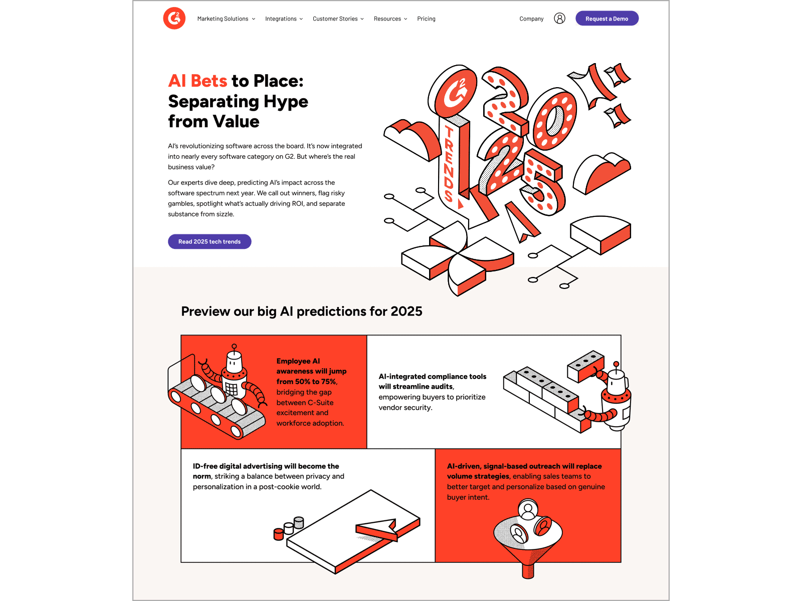
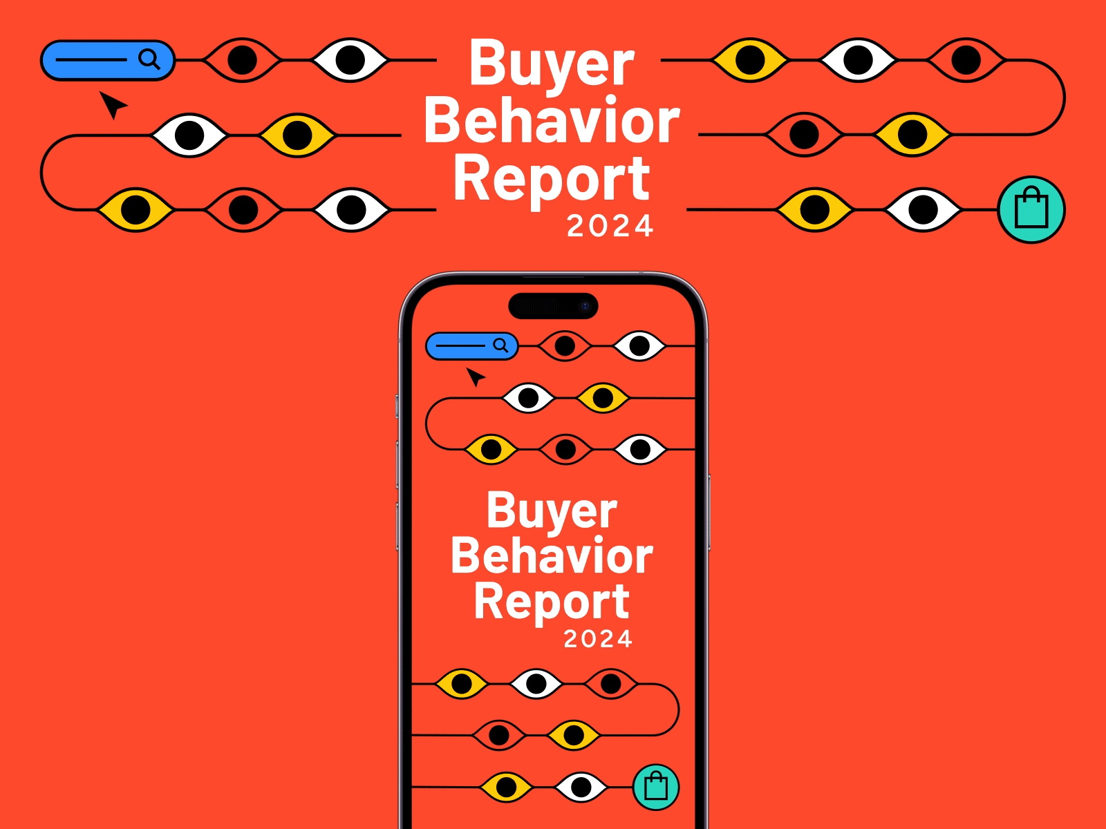
Branding & layouts for various thought leadership reports & series
Core to the G2 brand offering are our recurring seasonal reports and blog series. Each of these campaigns —including the State of Software, Buyer Behavior Report, and G2 Trends— allows for a certain degree of flexibility with the core brand as a means of keeping things fresh and visually distinctive. As such, you’ll see variety in illustration style, color stories, type treatments, and use of motion. Select campaigns even utilize series-specific mini brand guidelines to enable external illustration support.


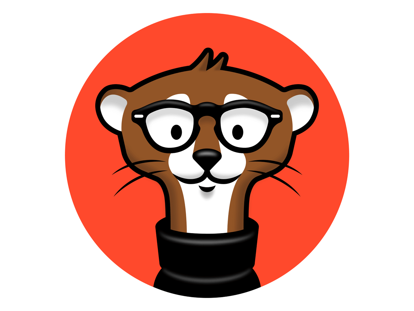
Branding for AI efforts & AI-assisted chat bot (Monty)
I joined G2 at a pivotal inflection point where AI positioning was increasingly important throughout the product & brand. As such, we needed a more cohesive POV and look that could be the throughline across those disparate touchpoints. The “Monty” mongoose mascot had already long been in use as an internal character before haphazardly becoming the face of our chatbot —and by proxy the rest of our AI functionality. He lacked polish and came with no guidelines, resulting in wild usage across the company. Beyond that, he was also never intended to be the stand-in for how we positioned AI everywhere. We instead —in G2 iQ— created an overarching brand to house all of our AI functionality and initiatives.


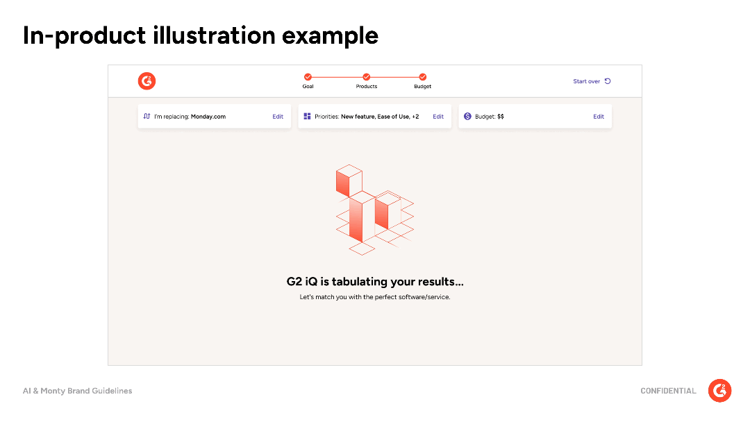
Explorations in iconography, illustration & pattern
At the time I joined, G2 illustration was a bit unruly from years of freelance and in-house designers each bringing their own style into the mix without full consideration of the system. As we began to refresh and formalize elements of the brand it become clear there was opportunity to minimize illustrative details and color palette as means of elevating things and reducing stakeholder misuse. While some of what’s shown below comes from the ideation stages and never made it to the final guidelines, it’s worth showing as a window into the process.


